Short Advertisement
Motion Graphics:Individual ~ Saiman Chow
web look up: http://www.saimanchow.com/
REVIEW
His works uses stop motion, photographs and graphic images to create a sense of uniqueness in his style. He seems to be sensitive with the choice of colors used in every single project ~ motion, print, exhibition, etc.
In this short advertisement on a promo for VH1 a television channel year 2006, he uses vibrant colors and his sketches to create this visually impacting advert.
There is visual contrast in the colors and textural elements used. In this work, he edited and remixed the lyrics of a certain audio to create his storyboards and ideas and he pays lots of attention on the fine details and smoothness of the transitions throughout the video.
Also, after viewing the video repeatedly, his drawing techniques have created a style different from others. The unifying elements used are shown in the varied text and the colors to show a presentable composition.
AUDIO
CHOICE OF AUDIO IS SUITABLE FOR THE STORYBOARD BECAUSE LYRICS ARE SYNCHRONISED WITH THE GRAPHIC IMAGES. Mr. Saiman Chow has indeed done his research for this advertisement on chn VH1 that after watchin the adv; it portrays a funky and lively television program used through this audio.
COLOR ENHANCEMENT
As the audio used has more of a upbeat and contemporary feel to it, the colors used are also more vibrant and attractive. The pop culture theme is being portrayed through the colors that goes well with the audio and typography. The colors used also depict the style of his sketches.
There is less focus on tonality though so the video has more of a two dimensional look to it making it feel not as sleek and refined.[not so sure if the designer does this on purpose] There are also less highlights and shadows shown.
TEXTURAL ELEMENTS
There seems to be a little tinge of texture elements used in this advertisement, however, if there was much more the look would be more finished. There is also not much experimentation of angles for focus on certain objects[maybe he wants to achieve more of an overall look]. The sketches drawn with expressive lines have created some textures but more experimentation would be better.
CONCLUSION
The designer is quite smart in the way he executes the advertisement because he is able to entice the audience to follow through till the end with the use of the audio as a surprising element. This designer is really a dedicated person as seen by his works so far ~ GREAT EFFORT!!!
Labels: DM3110 COMM SKILLS
It seems like i am helping Xin Qiang promote this c o l o r test that is able to depict your personality and life goals. It seems pretty accurate ~ to me its a must try.Rated 3 / 4 STARS *
Well, this is my results.
You are in a state of constant expectation and want interesting and exciting things to happen to you. But in fact, you are a 'Walter Mitty' at times - a dreamer - over-imaginative and often given to fantasy or day-dreaming. There is nothing wrong in 'dreaming' - how boring life would be if one just followed the doctrines of everyday life - but one must not continue leading a life of continuous fantasy. You need to face reality in spite of all its possible shortcomings.
You are a leader and possibly at this time in a position of authority, but you are experiencing problems. You are not quite sure how to handle the present situation.
Being emotionally inhibited you have no alternative at this time but to be a 'watcher' rather than a 'doer'. At this time you feel as if you are being forced to compromise and stand back. But this is not the true you. Deep down there is that warm 'open' you which is awaiting the moment to burst forth - maybe like the chrysalis which will soon become the butterfly.
As of late, you have been experiencing untold stress and this is a result of continuous frustration. You haven't been taking care of all your physical needs and it's beginning to show. It would seem that you have a need to find someone to whom you can really relate - someone perhaps whose standards are as high as your own. You want to be different - to be individualistic - to stand out from the common herd. Your inherent control of your sensual instincts is restricting your ability to give yourself to open up freely but this being on your own, being lonely, often makes you feel the need to give up some of your strict standards to surrender to the general flow - to be like everyone else; a part of the herd. Deep down you regard such instincts as weaknesses to be overcome. You would like to be loved or admired for yourself alone. You demand recognition and tender loving care.
You are putting on a show - a facade. You are a master of demonstrating considerable charm in the hope that this can or will lead to better things. Deep down you are fearful that this may not work and that you may have to employ other strategies in order to realise all your ambitions.
Take the test here.
The test is a real simple one, one you WOULDN'T regret.Pass it ON...^^
Site used :

Labels: Try It Out ^^
JUXTAPOSITION exercise
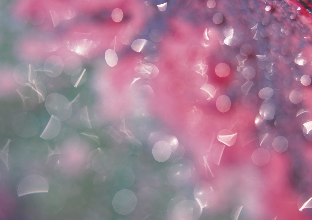
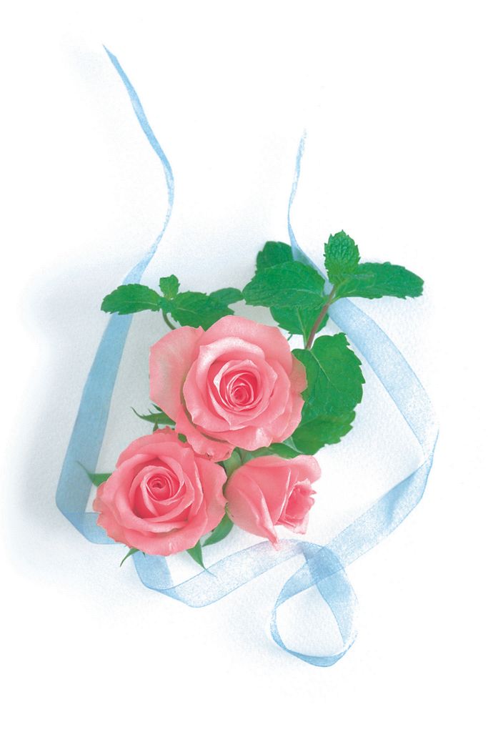
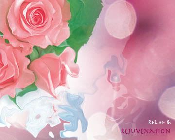
The emotion i wanted to portray with this montage is relief and rejuvenation. I know most people in this fast-paced hectic life and couldn't wish for anything better but to set time aside for recuperation and with that i wanted to set the scene that soothes the mind. The ambient is relatively crucial in order to bring out the feeling of rejuvenation.
The images used to represent this emotion are pretty pink roses and some lighting of flakes of coloured materials. The rose is the main focus so i placed the lighting in the background. In order to create the ambiance, the background is zoomed in so that not too much details can be seen.The image shows a bunch of roses then to focus on only a few roses, i cropped the image and placed it towards the upper left.Then i merge both images so that there is a sense of oneness and added some effects and filters to create a smooth flowy image.
The choice of font was also something crucial to accentuate the emotions.The font chosen is simple thus there is clarity and also to balance with the much detailed image.The font colour used were white and deep purple to blend in with the background but yet stand out enough to be read.
The overall look somehow gives viewers a comfortable feeling where they can somehow forget their worries for that moment and maybe to stop and give their eyes something to feast on. Please do give me feedback via comments on this work. It would be much appreciated. :)
Labels: DESFUN wk 06
My first project wasn't as good as i hope it would be... portrayed myself as a chocoholic not just because i crazed chocolates but have a deeper feeling for it ~ Quality places a huge role, i wanted to show that no matter how well you know yourself, you are still learning about yourself. I guess it didn't come true to my expectations and disappointed some but i know that this is not the end but a start of something new.
Fear of losing something that i possess...Process is always much more worthwhile than the outcome ~ my theme to start it off...that when something was so close to your heart and soul that you could suddenly not knowing lose it somehow. I am sure that many understand it and have felt this way before. Well, but we should always pull ourselves together knowing that things will turn for the better ~ there will always be that silver lining on that however small and tiny cloud.We learnt from our experiences ~ for me, it always to think out of the box <-[_]-> never fear pushing ideas to the edge even if its one step past boundaries!
Once a hildan, Always a hildan! ~ my sch's message to carry with us though we leave our sch because all of us gotta progress forward in life but our heart will always be with them **, With Regards to St' Hilda's Sec. "GO FORWARD" Exodus 14:15 ~ sch motto
Labels: Projectz
DESFUN ~ part A
forms from NATURE
~ works of Richard Sweeney
Fractal Form I
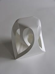
Icosahedron II
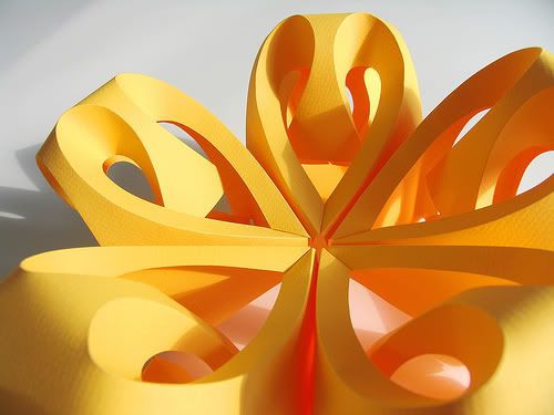
Richard Sweeney's works (origami style) through his hands-on material manipulation, undergoing an exploration process to find new ways of interpreting to the material to create forms that are truly sympathetic to the intrinsic properties of the material. Elements of repetition is portrayed through his works to create that balance in his compositions. The way the principals of nature are applied - to create forms that appear amazingly complex, yet are based on very basic units and patterns of growth. Also achieving the most from the least, from the way they are constructed, to the appearance of the final form - truly inspiring! His photography skills are also sleek and refined, a true professional.
Pentagon Pod
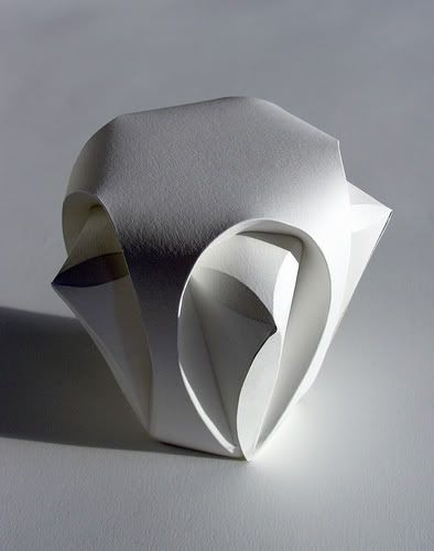
Dodecahedron II
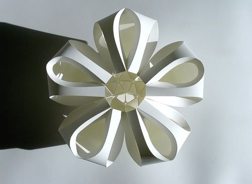
design inspired by FORMS of LIFE
Seed Pod
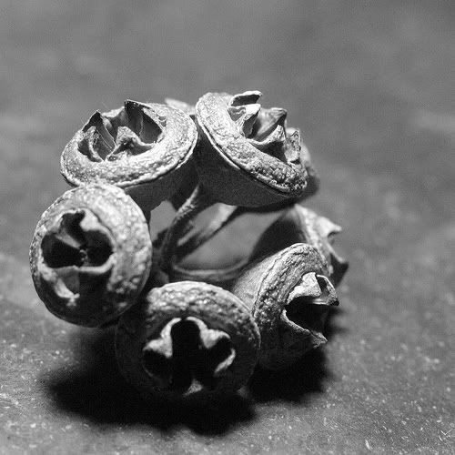
Holland Paper Biennial 2006
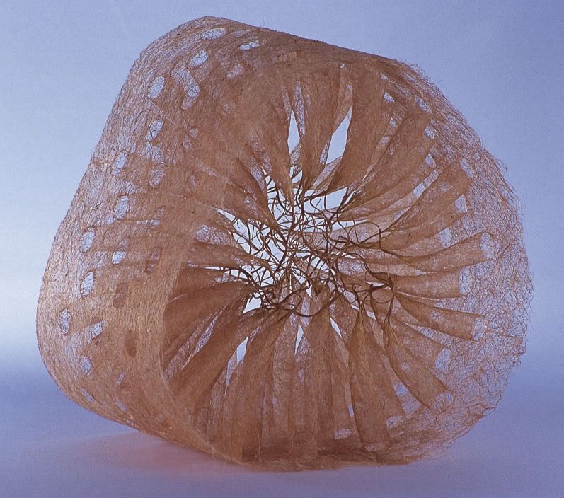
From what i have learnt so far is that mother nature is true beauty because the proportion of forms seen are nearly flawless. Nature has given so much attribution to art and design and help many artists to prosper and mature. It is totally awe-inspiring. Mother Nature is THE BEST teacher!
DESFUN ~ part B
screen shot of illustration/graphics design or artwork
Motion Graphics: Individuals ~ Saiman Chow
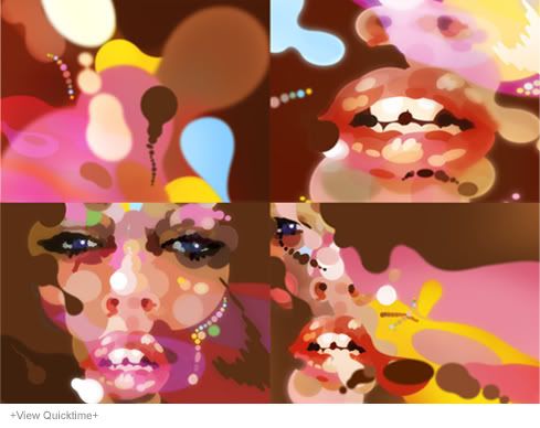
Review
His works have a unique style often using vibrant colors for print, motion and exhibition. Most of his motion clips uses stop motion to create the visual effects. His works seems to be more dependent on hands on approach thus his emotions flow through and his own individuality.
Visual Contrast
This graphic design work entitled Sexy Bubble - Aero is really a much different style from his other works. He seems to portray more of the sensual feel with the play of colors and execution of different angles. He is very sensitive with color usage and it shows through the illustration, every color pigment is chosen very wisely and the sensual feel is mostly depicted through them. The ambient color and accent color chosen suits the work very well.
Textural elements are also present to show depth and dimension which is crucial because it gives a perspective in the visuals in order for viewers like us to enjoy and appreciate it! The layers are created with different opacity levels and filtering to create ambiance. There is also areas of highlights for more focus on the human figure. This motion graphics designer has done a great job in creating visually exciting works of art and he is one true artist who is pays lots of attention to the details!
Labels: DESFUN wk 02