
SOUTHEAST ASIA - wayang kulit
 DALANG (The Puppet Master or The Story Teller)
 After deciding the title of wayang story, a dalang (puppet master), a dalang to perform the show must be appointed. Dalang position is very important, as he is the leader of the performance. Sometimes dalang could be chosen first, afterwards a consultation with him could be held to choose an appropriate title.
Dalang comes from the words juru udalan (juru : an expert, a skillful man - udalan abbreviated to dalan, then becomes dalang means to tell stories), so dalang is a story teller.
Dalang is an overall artist. He must have a broad knowledge of several disciplines of arts, such as :
1.
Mastering deeply the stories of wayang Ramayana as well as Mahabharata, knows the characters of wayang figures.
2.
Having a thorough knowledge of Javanese philosophy and moral ethics, as Javanese philosophy and moral ethics are inter-connected, or might be almost similar.
3.
Having an accurate information in many aspects of life in the country (or even internationally in this era of information and globalization).
4.
Having a good and clear voice, as he has to imitate about 50 (fifty) wayang figures with different voices. He has to explain every occasion, which has or should happened. And he has also to perfectly master the language 'high' and 'ordinary' used in dialogue, song and narration. He has to be a good singer, as he has to sing a lot during a performance.
5.
Having the ability of preparing the scenario, so that plot of stories should flow smoothly, in accordance with standard patterns.
6.
He has to know gamelan (Javanese musical instruments) used to accompany the show. He has also the capacity of a conductor as he should command the gamelan music; when it should begin and stop, and he should ask the gamelan crew what kind of music or song to be played.
7.
He has to lead the chorus of pesinden (women singers), usually consists of three to five singers and wira swara (male singers).
8.
He has to be skillful to move the puppets attractively.
9.
He has to know how to make good jokes, at the sametime advising the audience unnoticeably.
This part of play occurred at midnight at the Goro-goro episode, which last about one hour. During that time the Ponokawan appears. At most occasion the dalang plays a role as mouthpiece of the sponsors. In a performance organized by Agency of Family Planning, he should arise the topics of Family Planning. In front of the arm forces or police forces, he should speak of leadership and discipline. Before an audience in university he should speak of knowledge, good conduct and the goals of life.
In the village, he should speak about the spirit of cooperation, development and any topics, which should give optimism to the villagers. The topics might be different, but here are similarities; he should tell it jokingly, interrupted by many songs, sung by the pesinden - women singers, accompanied by gamelan music. He should insert some advises on morality, hard working and every deed must be conducted properly not hurting other's feeling, not breaking the laws, especially the highest law such as the law of God.
Generally the Goro-goro time is full of laughters and musics, which make the audience happy and entertained.

Last but not least a dalang must be a healthy man or woman (nowadays, there are some women dalang), with a good physical endurance because dalang has to sit cross legged for eight hours on a mat to perform wayang.
 The audience, from the very young to the very old, including one white man, was held spell bound by the skills of the dalang and the stories he told. Little children, cradled in their parent's arms, stared wide-eyed at the screen, transfixed by its magic.
Labels: team: 5fingers
Qn. 1 Why do images, pictures, art have a powerful impact on us?
They happen around us everywhere through different mediums and they come across as an inevitable element. We seek them due to our desire for knowledge and the influence of our culture. Our minds seek for things fresh and interesting during our human lives. I feel it is the lifestyle we live in that affects the extent of impact it has on us.
As we humans live in a systematic and organised way, we rely a lot on our visual senses, just like our ancestors did. The images or art we see influence our way of life, our mindset and thinking, though it may not carry such important and drastic changes. We eventually live on them and need them like a neccessity. This would sink in deeper and deeper as our lifestyle in the world evolves.
Qn.2 Why is the modern world dominated by unrealistic images of the body?
As we are by nature drawn to our senses and refer mainly to our bodies. Our brains have inclinely wired the behaviour to seek the primitive way. Creating structures of our body to be exaggerated and I think its something to do with the need to express our physical and mental desires for the innate unconscious self. However, we are also influenced to desire perfection and be conformed by culture during periods of time such as the egyptian and greek periods. Both showed great dominance of constructing bodies.
The egyptians and greeks both shared the same issue of culture affecting their view of the human body. They studied and expressed it through culture eyes. The values that had all reflected and represented a particular aspect of our culture in the human body, thus, creates such a highly influenced lifestyle in world.
Labels: DM3231 MOPCU
SONARC wk5
in-class excercise:
Analyse this commercial. In no more than 300 words, using the knowledge picked up from the reading materials above, argue if this commercial is effective or not.
Agfa waterproof camera
This commercial uses humor as a strategic idea to appeal and thus hook the target audience which in this case is catered to adults ageing from youth to manhood.
Humor is one of the best strategy to infuse interest and grasp attention because almost everyone can relate easily to. Although it may cause distraction to fully sell on the qualities of the actual product.
In the first 5s (crucial period to grab attention), it has successfully managed to capture the viewers' attention and create suspense. It starts when two different subjects of contrast are placed into the environment where the usual reaction to the situation is different from expected. The situation starts in the shore where a nerd and 3 babes who seemingly intend to tease the guy.
Then the suspense is held when the girls teased him by removing their bottom suits and waving it in the air (quite suspected not much of a shock).
Then the suspense is held when the girls teased him by removing their bottom suits and waving it in the air (quite suspected not much of a shock).
Next, we as audience will think so 'how will the guy react?' This maintains the audience. Next, he walks closer towards them with a perverted look and ...
starts to take snapshots underwater using a waterproof camera!
After this, it zooms in to the expression of both sides and the nerd lifting up the camera and looking into it.Then the product is introduced, however, there is no description about the text besides the use of audio which should be improved further with use of typography.
Later, there is reinforcement of info on the clarity of product as one quality to conclude it showing the guy relaxing and looking at the photos he has taken(with a shy expression).
Also, notice how the clear the water is! and the ladies are represented like "charlies' angels" with different skin tones, and the representation of a nerd as a white american.The way the nerd speaks also clearly confirms his character, but later the move that he makes starts to contradict what soft-spoken nerds would do!
This ad. is overall successfully with its catchy video but it has relied on making us change our perception of different people (stereotyping),e.g, nerds & babes.
REBRANDING ADIDAS part 2

ADIDAS underlying philosophy - a name that stands for competence and in all all sectors of sports around the globe
Their AIM - to provide every athlete with the best possible equipment
Adi Dassler followed three guiding principles in his dev. work (qualities for the competence of the company)
I. PRODUCE the best shoe for the requirements of the sport
II. PROTECT the athlete from injury
III. PRODUCT made durable
BRIEF DESCRIPTION
My initial chosen logo was mainly based on representing the factor of durability and competence seen through adidas.
I also wanted to incorporate the unmistakable identifying symbol: the Three Stripes, so just to enhance the logo with what is up to date and adidas being unique and outstanding from other sports brand in the world.
FINAL LOGO BRIEF
Durability is evident in the design, with design principles like stability and balance taken into consideration.
It is suppose to be represented like a shape of a boomerang ( formed from the Three stripes) with the nearest stripe towards the right being the heaviest and thicker than the rest to give BALANCE in the composition.
It is also shaped to look like a combination of A & D ( some of the main words of adidas). If you realised that adidas has more a & d.
The arrow form is also shown to represent the ever-ready spirit to tackle any obstacles in the way, as adidas faced many trials in the past.
Week 4 task
-Pick 1 of your logo designs
-Develop 5 detailed design variations in Illustator
-Must be vector quality (in illustrator)
-Play with the scale, placement, orientation, font, etc.
-Be prepared with that 1 central idea (underlying philosophy)
Labels: DM3121 ADCON
THE CONNECTION
Subaru commercial- Blade Runner Inspired
Spin: Make your life meaningful, with the best of everything you deserve!
I. target audience: middle-aged working adults,age 30 and above
II.Everything shown in the ad is like a glimpse of the future and also emphasize on technology advancement. It portrays a clean and sleek look in life and that suspense that carries to the end of the ad.
It is showing the kind of life that human will desire when entering the phase of their life with success and great opportunities. The eagerness to try something that will be adventurous and making it an 'in' thing.
- color contrast of cool and warm colors: bluish black against red
- contrast in the use of soundtracks: fast-paced,energetic vs calm,relaxed.
- desire for perfection is carried through this ad.
BMW Commercial- Defining Innovation
Spin: Life is short. 'Dare to dream DREAMS' with this car.
I. target audience: youth that appreciate art and the creative industry
II. This ad is more of reaching an edge in time with the use of artistic form (simplicity) and showing the reality but with vision and dreams.
Something that may inspire human with dreams, could be what is the driving force behind that commercial, to have a better standard of living, quality of life.
- natural and earthy look and feel
- soundtrack used: gradual increase in speed, inspirational
- yearn to have such a creative mind beyond imagination (awe-inspiring)
Among the commercials you have picked and analysed the SPIN, choose 2 that you think are most effective:
I. define the target audience
II. describe how the SPIN was treated such that it becomes effective using models/ideas (e.g, color mood, various contrasts, genre, sound, etc.)
Labels: DM3122 SONARC
Underlying Philosophies of other logos
BMW Logo

The design represents strength, durability and elegance of the product manufactured by company that produced aircrafts during World War 1.
Being a Bavarian company, in their logo design BMW choose to use the color of blue, which not only represents sky but is also the traditional color of Bavaria. Stylish use of the white color represents the blades of the aircraft engine. Both colors used alternately showing the airplane propeller spinning through the sky.
The BMW logo design represents strength, durability and style.
Microsoft Logo
It now features the slogan: “Your potential. Our passion”, which echoes a strong voice of consumer satisfaction and the brand’s fidelity.
Microsoft logo is a perfect example of ‘innovation meets simplicity’. The logo intelligently expresses the company’s mission of providing quality products to the customers with its strong slogan and simple typeface.
The logo consists of a simple typeface with an equally powerful slogan symbolizing potential and passion. Though the Microsoft logo was subjected to major critical transformations over the decades, its principal message has remained largely unaffected.It was later discarded as the company’s trademark in 1994, when Microsoft adopted the more compact version of the current logo with the tagline: “Where do you want to go today?”.
UPS Logo
During its 97 years history, UPS has used four UPS logos as its corporate identity. But during each redesign, the changes were gradual in the UPS logo.
The first UPS “shield” logo was created in 1916 when its founder Jim Casey merged the company with a local rival delivery service. That UPS logo featured a shield and an eagle carrying a package with the words “SAFE, SWIFT, SURE” inscribed on the side. The famous shield used in the first UPS logo continues to be used even today and UPS employees often refer to the UPS logo as ‘the shield’.
The second UPS logo was introduced around 1937 and displayed “UPS” for United Parcel Service on it. By that time, the company had grown enormously and was also providing delivery of merchandise for multiple retail department stores. Thus the phrase, “THE DELIVERY SYSTEM FOR STORES OF QUALITY”, was later incorporated in the UPS logo to signify the growth of the company.
Renowned brand designer, Paul Rand, designed the third and more simplified version of the UPS logo in 1961. The newly renovated UPS logo featured ‘a bow-tied package above the familiar shield to express the mission of the company’: of offering package delivery as its sole service.
Reason for updating their logo design?
‘As part of the rebranding, UPS adopted its fourth UPS logo, marking the first change in the UPS logo in 42 years’. On March 25, 2003, UPS with the help of FutureBrand, unveiled its new corporate identity with a new UPS logo.
The most significant change, in the new UPS logo, was the removal of the bow-tied package above the UPS shield. Ironically “the bow”, which had become one of the most recognized features of the UPS logo, has been subjected to refusal by UPS over decades as the string refrain UPS’s abilities to represent itself in various supply chain services. Contradicting, the string in the bow-tied package can get caught in UPS’s high-speed sorting machinery. The new UPS logo symbolizes UPS’s expansion from package delivery into a broader array of supply chain services.
But one thing in the UPS logo that has remained constant is its logo color and that is brown.
NASA Logo
The NASA logo is a powerful reflection of the agency’s history and tradition. It is used in NASA’s space and aeronautics programs and day-to-day communications materials with clear guidelines. The NASA logo visualizes elements of space exploration and aeronautics, focusing on the agency’s technological pursuits.
The story behind NASA logo
The first NASA logo can be traced back to 1959, the NASA Lewis Research Center’s design was chosen as the final selection, which featured the Sun, the moon, the white stars, the orbital path and the red chevron with “National Aeronautics and Space Administration” encircling the image.
2nd Redesign of logo is due need for less formal usage.
edited logo - cut down just leaving the stars and orbital path on a blue background with the red chevron passing through the letters N-A-S-A. This revised version of the NASA logo represented many aspects of the space and its relative nature to the agency.
Labels: DM3121 ADCON
SEMESTER II PROJ
ASSIGNMENT BRIEF
REBRANDING ADIDAS
- new identity based on research
- rough initials logo designs
- underlying philosophy
- rough idea of use - where & how
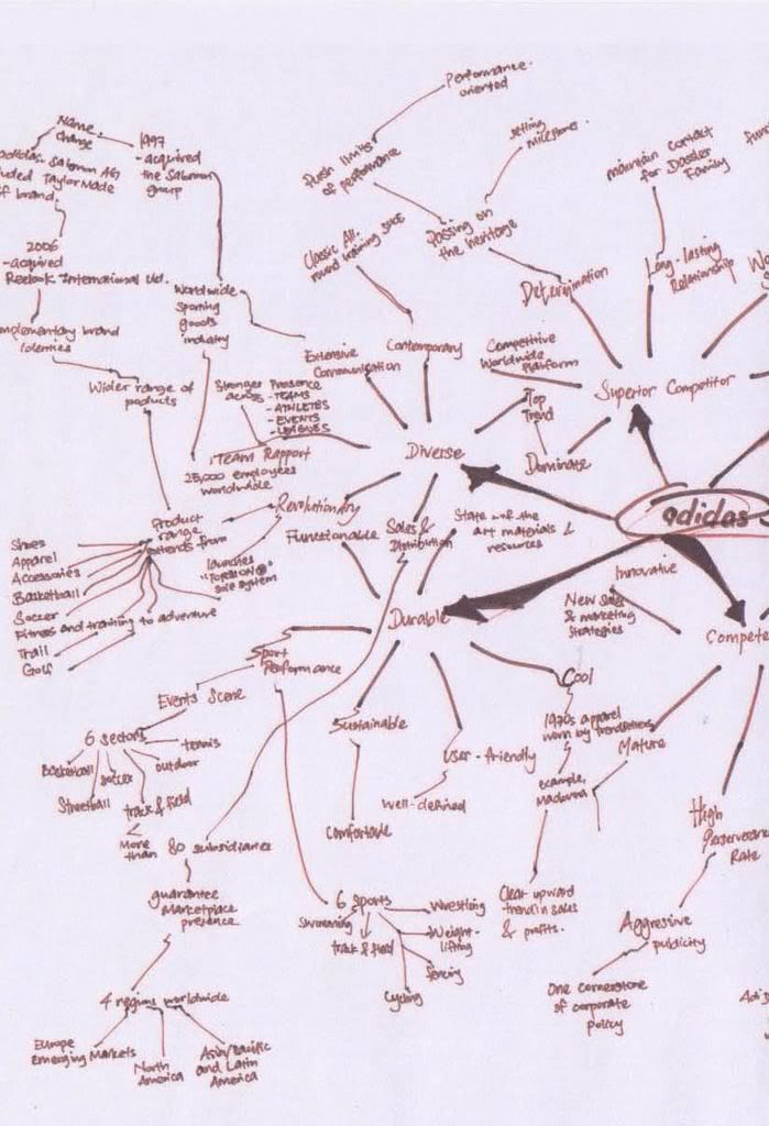
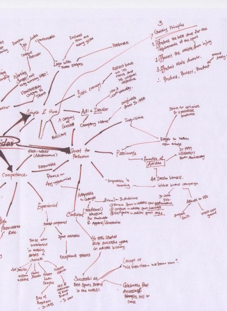
Semantic network mindmap of adidas
FULL VIEW

LEFT VIEW
Initial Logo Designs

RIGHT VIEW
Initial Logo Designs

Labels: DM3121 ADCON